After my first round of posts regarding a new render style I was asked what was different about it. So here we go :)
First thing first lets take a look at an example image.
Here is the before:
Here is with the new process:
Step 1: Materials and PolyPaint
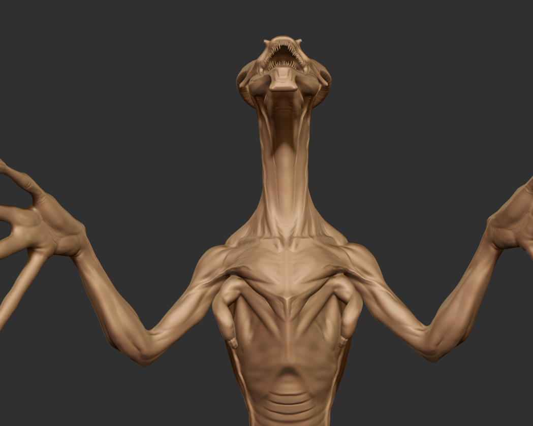
The key to having a better render lies in the clear communication of material types. Materials that try to emulate real world counterparts and ones that don't muddy the detail of the sculpt. In previous renders a lot of my work lacked this. It follows a "1 Matcap/Lightcap to rule them all" mentality. Detail and visual interest both in the paint and the sculpt are lost in favor of a quick workflow. However, this is utterly misguided. In art school I remember taking a painting class and the one lesson that continues to have the most gravitas is contrast. The mind likes contrast, things playing off each other. Whether that is color, shape, materials, specularity or what have you, an image is infinitely more interesting with contrast. This means for certain sculpts going back and creating a more detailed poly paint which emphasizes the the contrasting shapes of the sculpt. This also means using the power of zbrush material painting to create areas of contrasting materials. In this example it can be seen by adding a high specularity material for mimicking the drool soaked mouth of the creature. I also increased the amount of wax preview in the gum material to make it feel more puffy and blood filled. The mouth is the main conceptual contrast of the piece so I took time to experiment with drool patterns and amounts of specular highlights for maximum emphasis.
Step 2: Base Zbrush rendering
Having been using ZBrush since version 2, BPR is probably one of the best features of the modern zbrush toolkit. After the overall look feels good I position the base zBrush light, turn on shadows, Ambient Occlusion, and wax preview, tweak settings for these features and kick off a base render. Usually this looks something like this:
Base Render
Now this has some nice things going on but it lacks alot of depth and contrast. Everything exists all at the same level. Inside the render pallette I save off the various render passes included in the BPR. These are the shadow pass the AO pass, the depth mask (for post process depth of field effects) and a mask pass for removing the flat background. The Great thing about these passes is it allows me to control color value and strength of these parameters in with great speed in photoshop instead of waiting for render times.
From Top Right to Bottom Left: Shadow, AO, Mask and Depth Passes
Step 3: Light Rendering
Again, contrast is the name of the game. If we comp these initial passes together we get something like this:
So Dark.....
As you can see everything is really dark. there is some highlight but much of the form is masked in the shadow. So we head back to Zbrush and render out some additional light passes. This way much like the shadows and AO we can control the strength of light and color of light quickly with tweaks in Photoshop. To do this, first I turn of poly paint and fill the object with a light grey. I then set the material to the standard blinn material so as to achieve a simple highlight. In this case, I rendered out a rim light (from behind) and a top light again to contrast the direction of the core shadows to better highlight form. These look like this:
Light Passes: Top and Rim Lights
Once these are all saved out I close out Zbrush and head into Photoshop for compositing.
Step 4: Color Shading
So a while back Danny Williams, aka pointpusher, showed off a video of his texturing process. One of the things both he (and most of my art instructors said) was using straight black for your shadows/AO can really flatten out the image. I noticed this was true while working on the stylized textures for Rinth Island. So I adopted a practice from him in which instead of just multiplying the AO/ Shadow layers I create a solid fill layer and then use the inverse AO/Shadow image as a layer mask. This give me complete color control of my shadows. In addition, this allows me to have more color variation and prevents color burn form the straight black value. This also helps especially when the layer is set to the soft or hard light blend mode. The effect can be subtle but it is noticable. Here I have used a saturated purple to better mimic sub surface scattering and to add some bluish color to contrast the red of the skin. The result is a more color rich image.

Left: Color shading and Soft light Blend mode Right: Greyscale with multiply
Step 4: Light Compositing
I use a similar technique for my light passes. However, I don't need to use the inverse for the layer mask. Again this gives me complete control of my light strength and color. I set these layers to linear dodge for a more dramatic color blend. For key fill lights I tend to like warmer yellows and oranges and my rim tends to be cooler blues. I also tend to make the key a higher value and the fill/top more midtone to prevent highlights from being inconsistent. After fiddling with colors, values and strengths, I get an image with better contrast. At this point I also wanted more key light so I duped the original image, desaturated it and upped the contrast. I then applied it as a layer mask to a color as well. I also the origianl image and set it overlay at 31% for just a little bit more color. The result of all of this is an image that looks like this.
With Colored Lighting
Step 5: Backgrounds and Depth of Field
At this stage I like to use the mask layer to remove the black background. I add a custom gray scale gradient with a little bit of lighting information to match the light source of the key light. I honestly have a love hate relationship with Depth of field. Sometimes it can be overused. However in this instance since the bust has some rougher edges, so i give it a very little amount. After this is all said and done I save out a .png and pass it to the internet.
Final Image
Hope this has been insightful!
Cheers!


